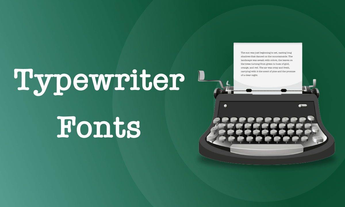
Unveiling the 21 Best Typewriter Fonts on Google Docs and a Guide to Mastering Them

Summary :
Check out the 21 best typewriter fonts to use in Google Docs, and learn the detailed steps to add typewriter fonts in Google Docs documents.
Content Table
Best Typewriter Fonts on Google Docs
Nowadays, it seems like everyone is vying to create designs that seem the most contemporary. But, even though we are living in a world that is characterized by modern digital technology, some of us still favor the antique appeal of a typewriter.
There is merit in occasionally indulging in one’s memories of the past. In some scenarios, a vintage typewriter font might be the ideal component to give your documents a touch of retro elegance.
We have this post for you if you’re seeking a Google Documents font that accurately reflects the design and feel of a typewriter. You may select from the more than 20 fonts we’ve reviewed and test them out in your Google Documents. These fonts are worth exploring for retro-tone enthusiasts and everyone else.
Best Google Docs Typewriter Fonts
1. Courier
Courier is currently freely used and one of the most popular fonts due to IBM’s decision not to pursue any sort of copyright protection for the typeface. It was created in 1955. Later, someone redesigned it to work on IBM’s electric typewriters.
This typeface is monospaced. Each character is the exact same width. Certain glyphs are not as noticeable as text content when used alone. I choose Courier since it is a great choice for creating program source code and won’t make you stressed out as you read.
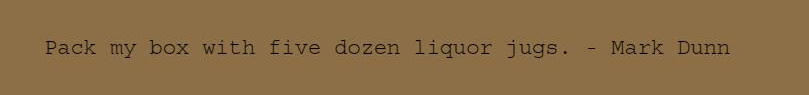
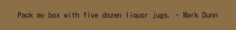
Courier
2. Courier Prime
A modified and expanded version of Courier is called Courier Prime. Compared to standard Courier, Courier Prime is somewhat thicker. The typeface also features small adjustments that improve screen readability, such as higher heights and broader letterforms. The serifs are less rounded and sharper. Finely broader counters are also present.
The elaborate design of Courier Prime makes it less sporadic with true italics and stronger bold. At any given point size, the width of each letter in this typeface is the same when printed on a page. Although it was created for screenplay printing, it also looks fantastic on digital displays.
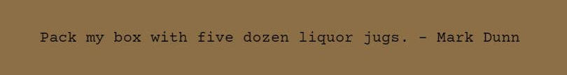
Courier Prime
3. Cutive Mono
Anybody seeking a vintage typewriter font with some charm may consider Cutive Mono. The design is inspired by some of the best-known typewriter styles from the past, such as Executive and Smith-Premier originated from IBM.
It may be used in greater sizes for headers and display as well as to add characters to text content. Even being at smaller sizes, there is good clarity for Cutive Mono. In a nutshell, Cutive Mono has a retro vibe, which might make your papers more endearing.
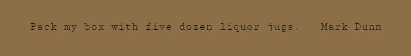
Cutive Mono
4. Montserrat
The font Montserrat was created by Argentinian designer Julieta Ulanovsky. It is a geometric sans-serif font. This typeface, which is available in three variations, is reminiscent of early 20th-century modernism but is less formal. Short all-caps phrases and the geometric simplicity of the letters give Montserrat a chance to stand out. It also serves as a really lovely font in lowercase that has a lot more personality than most other mainstream fonts.
Speaking of its application, Montserrat is excellent for producing a straightforward and professional-looking site design. The font comes in nine variations, ranging from thin to black, each with a genuine italic. Montserrat is a sans-serif typeface with excellent readability.

Montserrat
5. Lekton
The font Lekton was created in ISIA Urbino, Italy. Several of the types seen on Olivetti typewriters provided ideas for its designer. The typeface’s quick creation and simple aesthetic make it one of the more interesting facts about it. The letters have extremely straightforward forms and comparable widths.
Lekton has the appearance of faded telegraph lettering. The typewriter-like font and significant spaces between the words give it a typewriter-like appearance. The words are narrow and exact, and the glyphs trespass. If you prefer to arrange text, poetry, or abstract words in vertical columns, it may be used nicely.

Lekton
6. Oranienbaum
If you prefer an adaptable font that looks fantastic in both the headline and the body text. Oranienbaum could serve as the best solution. It’s a brand-new upgrade of the popular Antiqua-free artistic fonts.
With the unique number of glyphs in this font, Oranienbaum is a modern high-contrast Antiqua typeface with distinct and identifiable features. Being a typical typeface from the 20th century, it was influenced by the Bodoni-style Antiqua font’ architecture, which included powerful serifs, sharp contrasts in geometry, and a play between straight lines and curving ones. The font works nicely for both body text and headings.

Oranienbaum
7. Special Elite
The Smith Corona Special Elite Type No NR6 and Remington Noiseless typewriter models are two examples of old typewriters that Special Elite’s design is inspired by and designed to resemble. The typeface has elements of old-school analog tone and inked-up roughness. Your documents or artwork will be featured with a distinctive and eye-catching aged appearance because of this point.
You may use Special Elite vintage typewriter font for your website and projects by combining a little touch of the inked-up roughness and a little bit of old-school analog charm mentioned above.

Special Elite
8. Kosugi Maru
Created by MOTOYA and released on the Android platform with the Apache license, Kosugi Maru is a font for Google Docs that was created based on the Gothic Rounded pattern. It was inspired by a typeface from the 1950s. It was once marketed as “MotoyaLMaru W3 mono” but is now sold as Kosugi Maru. As Kosugi, a standard gothic variation is offered.
The Kosugi Maru typeface features rounded terminals, monospaced metrics, and a low stroke contrast. The typeface is reminiscent of the straight and substantial branches of cedars, which is primarily highlighted with beauty and readability and is reminiscent of Japanese cedar trees.
Kosugi Maru
9. Source Code Pro
Paul D. Hunt eventually produced Source Code Pro for Adobe, which was modified from the Source design in response to a need from customers for a monospaced form. Source Code Pro is a typeface whose primary goal is to function effectively in coding and user interface (UI) contexts.
Currently, Source Code Pro supports a sizable number of languages written in the Latin script. Although it was designed primarily for UI and coding contexts, for which a standard weight would often be adequate, it works well for more application scenarios than just these two.
Get Source Code Pro from Google
Source Code Pro
10. Roboto Mono
Roboto Mono is an addition to the Roboto-type family that is monospaced. The fact that the periods and commas are additionally emphasized to make them easier to spot is one of its key characteristics.
Symbols that are often used as operators have also had their scale and weight adjusted. Google has made Roboto Mono as readable as possible on screens in a range of reading contexts and devices.

Roboto Mono
11. Cormorant Garamond
The Regular or Medium weights of Christian Thalmann’s free display type family Cormorant are preferable for body copies since they are easier to read.
A total of 45 font files, including Roman, Italic, Garamond, Small Caps, and 5 weights, are included in the family at this time while 9 different visual styles are covered. Large copies in headers and subheads work better with the bolder weights’ higher contrast.
Get Cormorant Garamond from Google

Cormorant Garamond
12. Fira Code
A collection of ligatures for typical programming multi-character pairings is included in the Fira Code font – an addition to the Fira Mono font family.
Fira Code performs exceptionally well when it comes to readability to a better comprehension of texts, especially in programming environments where programmers utilize many symbols that are frequently encoded with multiple characters. The installation of this typeface on Windows, Mac, and Linux is currently permitted per the license.

Fira Code
13. IBM Plex Mono
Plex is an international font family created to represent IBM globally and to reflect the company’s design philosophies. The Plex family includes Roman and true italics in four different styles: Sans, Serif, Mono, Condensed, and Mono.
The typefaces have been made to function effectively in UI settings in addition to other media. With great readability in print, online, and mobile interfaces, IBM Plex Mono is a monospaced typeface based on IBM Plex Sans. Code snippets are also well shown by Plex’s Mono.

IBM Plex Mono
14. Inconsolata
Many programmers thought that the open-source typeface that was developed by Raph Levien – Inconsolata – is a very understandable and monospaced font to help them perform better at work.
Inconsolata was wholeheartedly suggested and a bold variation was added to Google Fonts although it used to have no bold weight. Inconsolata’s capacity to tell the difference between 0s and Os when the context is insufficient is one of its most significant strengths.

Inconsolata
15. Roboto Slab
Neo-grotesque sans-serif typeface family Roboto was designed by Google as the default typeface for its Android mobile OS. Roboto has two distinct identities. It has a mechanical framework, and most of the shapes are geometric.
In addition, the typeface has wide and amiable curves. Roboto doesn’t make any concessions, enabling letters to be put into their natural width, unlike certain grotesques that deform their letterforms to impose a fixed rhythm. Reading rhythm is produced as a consequence that is more comparable to serif and humanist typefaces.

Roboto Slab
16. Anonymous Pro
Four fixed-width typefaces of the Anonymous Pro family are created specifically for coding. It was created in the middle of the 1990s by Susan Lesch and David Lamkins and is based on Anonymous 9. It was created as a more readable replacement for Monaco, the fixed-width Macintosh system typeface.
Anonymous Pro has four styles (regular, italic, bold, and bold italic) and supports most Western and Central European Latin-based languages, plus Greek and Cyrillic. In the context of source code, characters that may be confused with one another (such as O, 0, I, l, and 1) have distinctive forms to make it simpler to distinguish between them.
This a font that serves free of charge matter for personal or commercial use.
Anonymous Pro
17. Space Grotesk
Based on Space Mono, Space Grotesk is a proportional sans-serif typeface variation. Space Grotesk, which was first created in 2018 by Florian Karsten, keeps the unique characteristics of the monospace while being optimized for better readability at non-display sizes.
All Western, Central, and South-Eastern European languages are supported by Space Grotesk, which also has many OpenType features (such as fractions, old-style and tabular figures, and stylistic alternatives).

Space Grotesk
18. Cousine
The Arimo (sans-serif), Tinos (serif), and Cousine (monospace) TrueType font families make up the Chrome OS core typefaces. The fundamental typefaces for Chrome OS include Cousine. These typefaces are meant to serve as open-source alternatives to the most popular Microsoft Windows operating system fonts, Arial, Times New Roman, and Courier New, which are produced by Monotype Corporation.
Steve Matteson first conceived Cousine as an avant-garde design. The pan-European WGL character set and improved on-screen reading qualities offered by Cousine meets the demands of developers searching for fonts that are width-compatible to address document portability across platforms.

Cousine
19. Syne Mono
For all of your imaginative creations, Syne Mono is the ideal typeface. The art center “Synesthésie” commissioned its original design in 2017. To create fresh and enlightening circumstances, the Art Center seeks to bring together a variety of talented individuals. On the basis of such a concept, Syne is an investigation of unusual correlations across weights and styles.
The typeface was created by Lucas Descroix and is available for both non-commercial and commercial use for totally free. The chosen letters might alter the font style. Some typefaces were made for specific purposes and do not support special characters.

Syne Mono
20. VT323
Peter Hull designed the font VT323 based on the glyphs of the DEC VT320 text terminal, for which some users still feel an odd fondness. Medium, Regular, and other font styles are mostly available in the VT323 font family series.
With assistance from Jacques Le Bailly, Dave Crossland, and others, the basic concept from 2016 was expanded upon and enhanced. Even though VT323 may be applied in a variety of situations, it excels in the design of logos.

VT323
21. Source Serif Pro
The letter forms of Source Serif were made to be easily readable in a digital setting. The typeface has a distinctive personality of its own that will stand out when used for long texts on paper or screens thanks to its historical origins and professional supervision. Source Serif Pro is a transitional-style serif typeface made to go with the Source Sans Pro family.
A careful balancing of letter sizes and typographic color results in the tight comradery of Serif and Sans. Source Serif is partly based on the designs of Pierre Simon Fournier, and it shares many of the quirks that distinguish Fournier’s work.
Get Source Serif Pro from Google

Source Serif Pro
How to Insert Typewriter Font in Google Docs
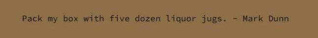
Step 1. First of all, you need to open your online Google file. Let’s use the above-mentioned sentence “Pack my box with five dozen liquor jugs. – Mark Dunn” as the example here, too.
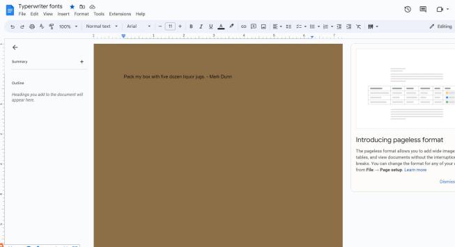
Open Google Docs for Adding Fonts
Step 2. Secondly, navigate to the toolbar and hit the button where the current font is shown. Then choose “More fonts”, there will be a search bar displayed.
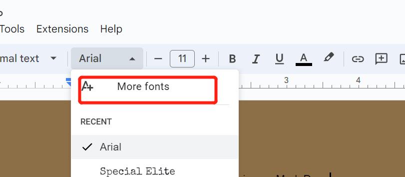
Hit the More Fonts Button
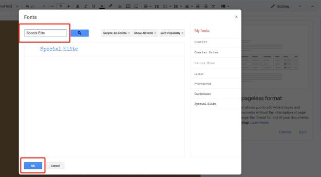
Step 3. Now, you need to type the name of the font you desire and choose the right one. Hit the “OK” button at the bottom and you can change the font of the text as you want.
For such operations, we may adopt add-ons for more explorations. Besides the use of text files, there are also many for you to explore in PDF editor add-ons on Google Docs online.
Insert Typewriter Fonts in Google Docs
Benefits of Using Typewriter Fonts on Google
If you’re thinking of including some classic yet lovely aspects in your designs, please make sure to spend a few minutes reading the above well-prepared fonts list.
A wonderful way to give different design items personality and substance is by using the greatest typewriter fonts. Bringing the feelings of nostalgia, typewriter fonts may provide a retro aesthetic to any of your docs. They can evoke mystery and suspense by appearing slightly worn-down and aged. There are typewriter fonts available, too, that are sleek, simple, and trendy and may be used for a variety of purposes.
Although the Courier typewriter font may be the most well-known, there are many others offered on the market online. Here are some of the finest typewriter fonts we’ve come across.
FAQs
What font is most like the old typewriter on Google Docs?
Special Elite is most like the vintage typewriter on Google Docs since it was literally generated from two real typewriters with its old-school tone and inked-up roughness.
How do you get handwriting font on Google Docs?
You may create a handwritten look for your document using one of the many handwriting fonts available in Google Documents. You can hit the “More fonts” button and choose the “Show: All fonts” bar, it will give you the option “Handwriting” with various choices of fonts shown below.
Besides, we’ve also prepared something interesting for you if you want to write on PDF files rather than just adopting handwriting style font in text files.
What are the best American typewriter fonts on Google Docs?
Courier Prime, Old Typewriter Font, and Special Elite are the best American typewriter fonts on Google Docs as their font weight, size, and overall style all resemble the characters generated by old American typewriters.
Conclusion
The samples above should have shown you that every font has its own distinct charm and personality. These typefaces will give your documents or drawings a retro vibe since they have a history that can be traced back to ancient typewriters. You may give your website a touch of nostalgia by using the proper typewriter font. For blog designs and personal websites, typewriter fonts are frequently advised.
In this post, we’ve introduced the fonts that would be ideal for building your website as well as those that work well for creating headers or logos. Hope you can find the one that suits your needs best, we’re really looking forward to your next perfect design with those fonts!
By the way, the files you want to edit by adding those typewriter fonts are PDFs, you can change them into Word files first. After you finish your design with those fonts, you can convert your docs into PDFs to make them stay in the original format.